Wine Label Design Case Study:
Sustainable Packaging for a California Winery’s Debut

Our Wine Packaging Design Approach: Heritage Meets Sustainability
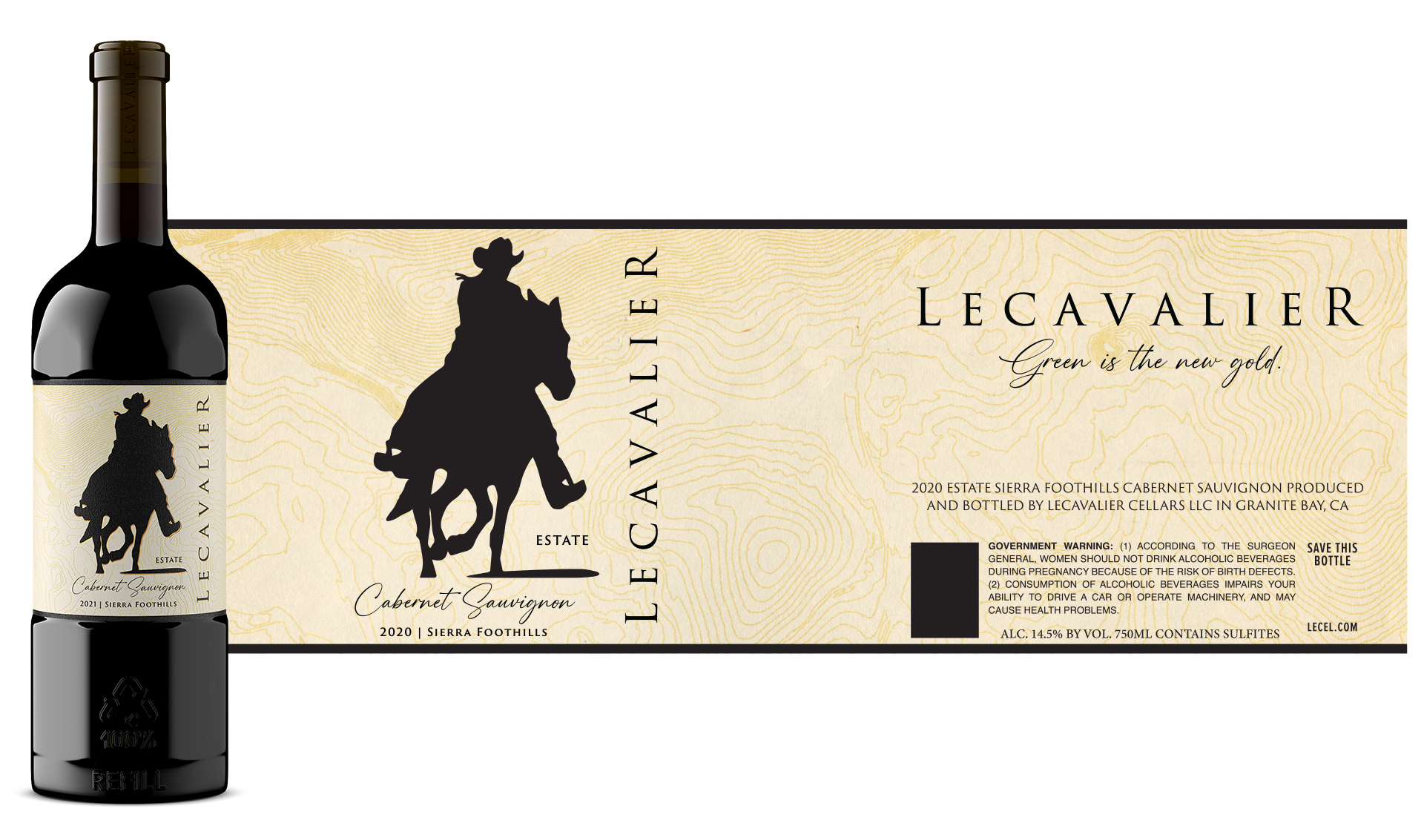
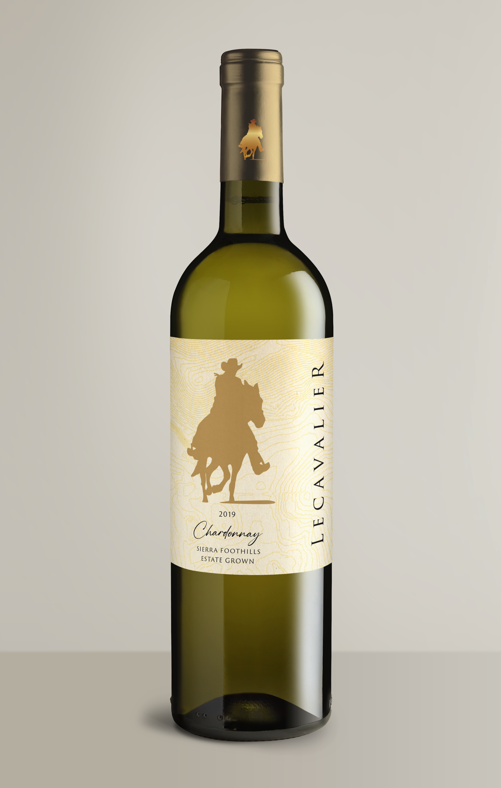
This wine label design case study shows how we launched a Northern California winery’s debut collection of 12 varietals. Our approach combined sustainable packaging design with heritage-inspired branding to create labels that honor California’s pioneering spirit while standing out in today’s competitive wine market.
The Challenge:
A new California winery needed wine packaging design for their first-ever collection. The labels had to establish credibility, honor the region’s Gold Rush heritage, use sustainable materials, and create a cohesive system across 12 varietals.


The Solution:
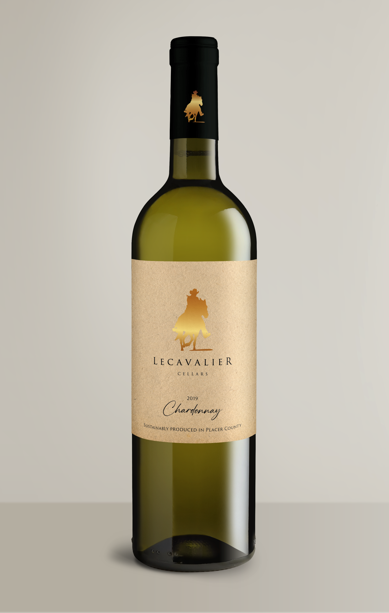
Visual Identity
We designed a subtle topographic pattern that tells the story of terroir, the land that shapes each vintage. This creates instant brand recognition while differentiating them from traditional wine label designs.
Sustainable Materials
The wine labels are printed on specialty stock that’s easy to remove, making both bottles and labels recyclable. Premium look, eco-friendly execution.
Design System
Classic typography meets contemporary design. Each varietal has its own personality within a cohesive brand family that scales as the winery grows.


The Result:
A Wine Brand Built to Last
This wine label design and packaging project successfully launched a new winery with a strong, differentiated brand identity that communicates heritage, quality, and sustainability. The comprehensive approach delivered:
Strong Brand Foundation
Scalable Design System
Sustainable Differentiation
Successful Market Entry
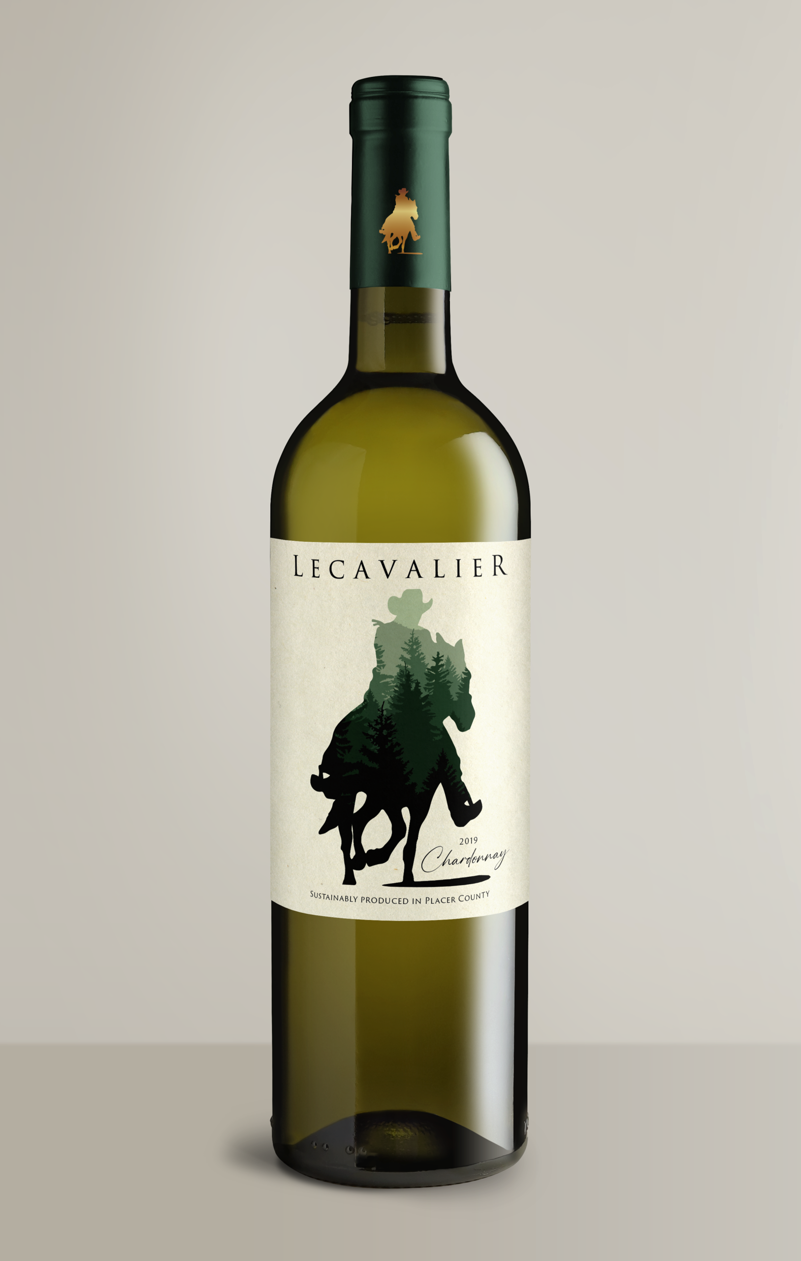
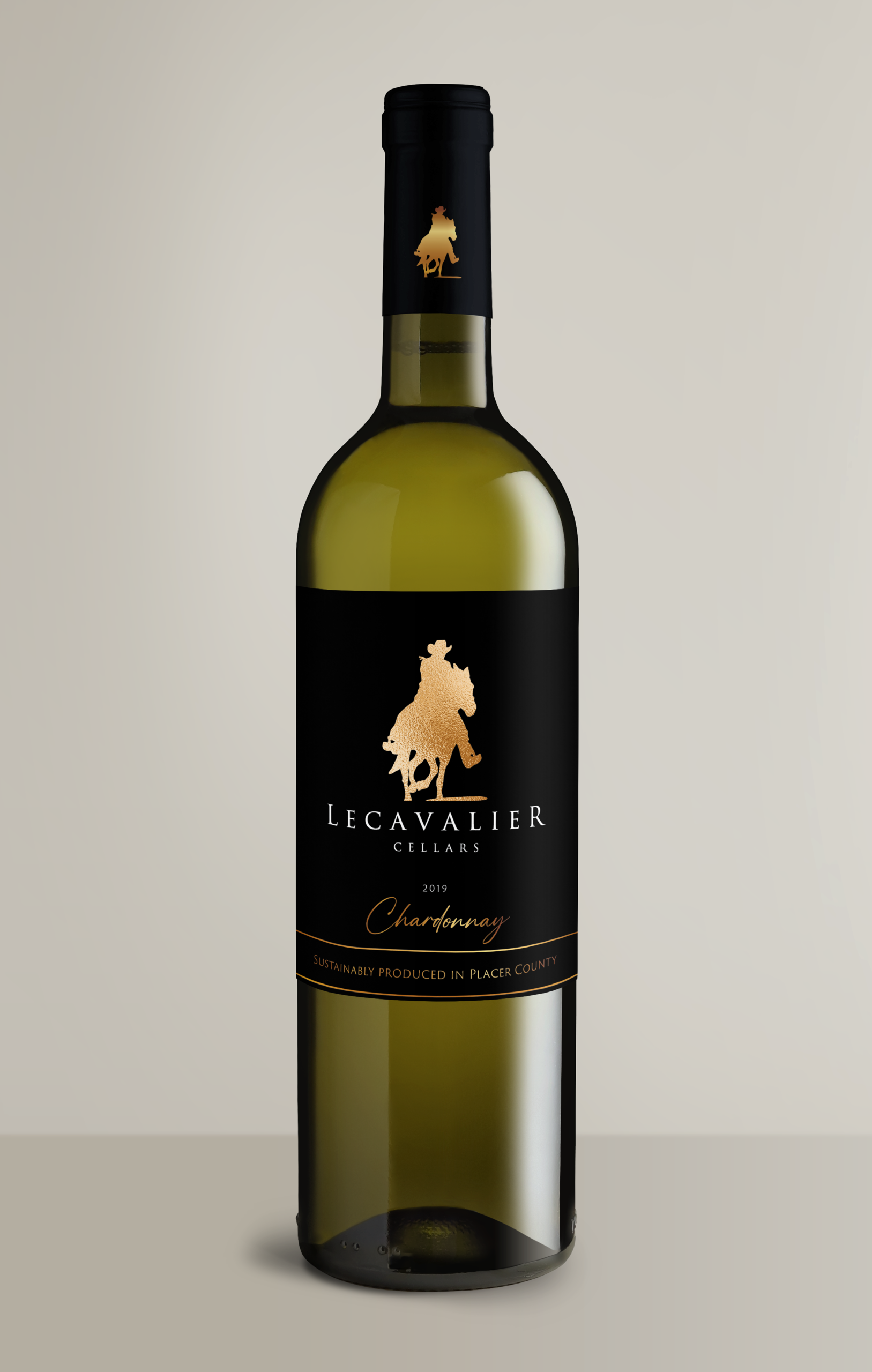
Design Exploration
Alternative concepts explored different levels of vintage inspiration, typography treatments, and pattern approaches before landing on the final direction.
Beyond
the Labels
With a tiny budget and a competitive launch timeline, we created bold video ads using strategically sourced stock footage. Scrappy approach, cinematic results.